+91 9312966129
 sparc.enquiry01@gmail.com


Excel Tutorial for Data Analytics Beginners
Learn Excel for data analytics step by step. Master formulas, pivot tables, and dashboards with this beginner-friendly tutorial. Start today.
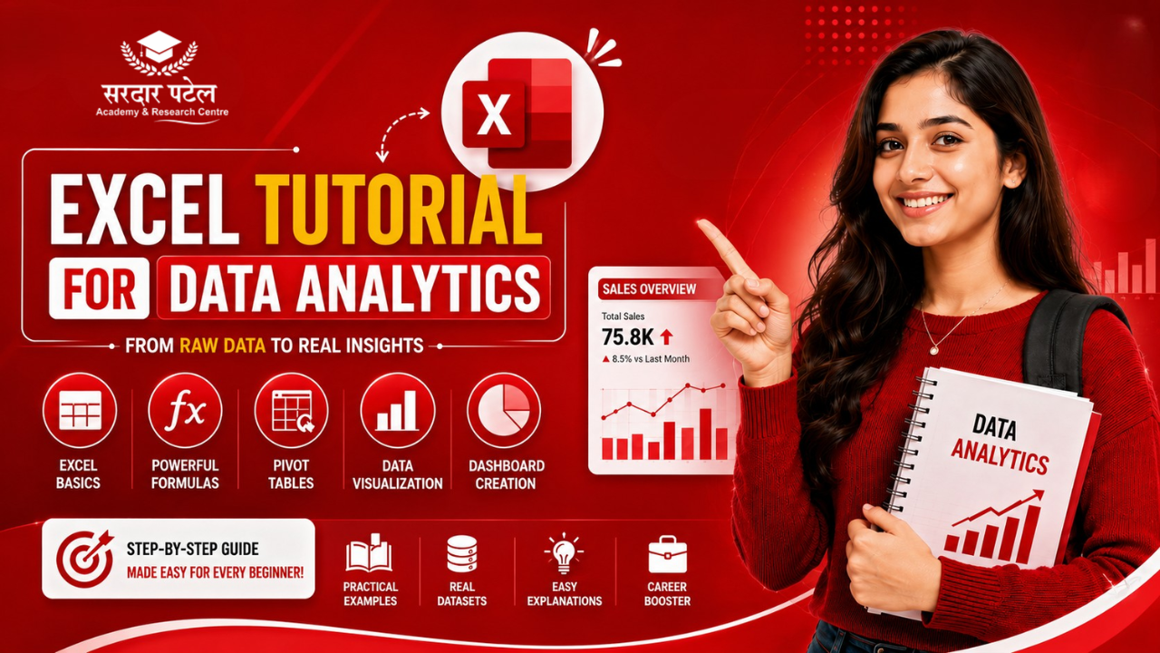
Table of Contents
- Here is what makes Excel the perfect starting point for beginners:
- The Ribbon:
- Cells, Rows, and Columns:
- The Formula Bar:
- Essential Excel Formulas Every Data Analyst Uses
- SUM, AVERAGE, COUNT, MIN, MAX.
- IF and IFS
- VLOOKUP and INDEX-MATCH.
- COUNTIF and SUMIF.
- TEXT Functions.
- Data Cleaning in Excel: The Skill That Sets Analysts Apart.
- Remove Duplicates.
- Find and Replace
- Flash Fill
- Filter and Sort:
- Pivot Tables: The Most Powerful Feature in Excel for Data Analytics
- How to Create a Pivot Table
- Data Visualisation in Excel: Turning Numbers into Insight.
- Choosing the Right Chart Type
- Building a Basic Dashboard.
- Create your pivot tables and charts on separate sheets
- Your First Excel Analytics Project: Step-by-Step
- The Business Questions
- Excel Skills Checklist for Aspiring Data Analysts
- Common Excel Mistakes Beginners Make (And How to Avoid Them)
- Mistake 1: Not Saving a Backup Before Cleaning Data.
- Mistake 2: Using Merged Cells in Data Tables.
- Mistake 3: Hardcoding Numbers in Formulas.
- Mistake 4: Skipping Data Validation Before Analysis.
- Mistake 5: Overcomplicating Charts.
- Sources & References
- Conclusion:
If you're stepping into the world of data analytics, Excel is widely considered the best tool to learn first — before Python, before SQL, before Power BI. It gives you a practical foundation that almost every analyst uses every single day.
This Excel tutorial for data analytics walks you through everything a beginner needs to know: from navigating the interface for the first time to building dashboards that tell a real business story.
| ℹ️ INDUSTRY STAT According to a 2025 analysis of 10,000+ data analyst job postings on LinkedIn and Naukri.com, Excel appeared in over 91% of listings — more than any other tool, including SQL and Python. (Source: LinkedIn India Job Postings Analysis, most recent available data; Naukri.com Analyst Skills Report 2025) |
The best part? You don't need a technical background. You need curiosity, a dataset, and a willingness to practice. Let's get started.
Why Excel Is the First Tool Every Data Analyst Should Learn.
Excel has been around since 1985 — and it is still the most widely used analytics tool in the world. Why? Because it is accessible, powerful, and available in virtually every organisation on the planet.
Before learning Excel formulas and dashboards, it helps to understand the bigger picture. Read our What is Data Analytics? Beginner Guide to learn how analysts collect, clean, analyse, and use data to solve business problems. 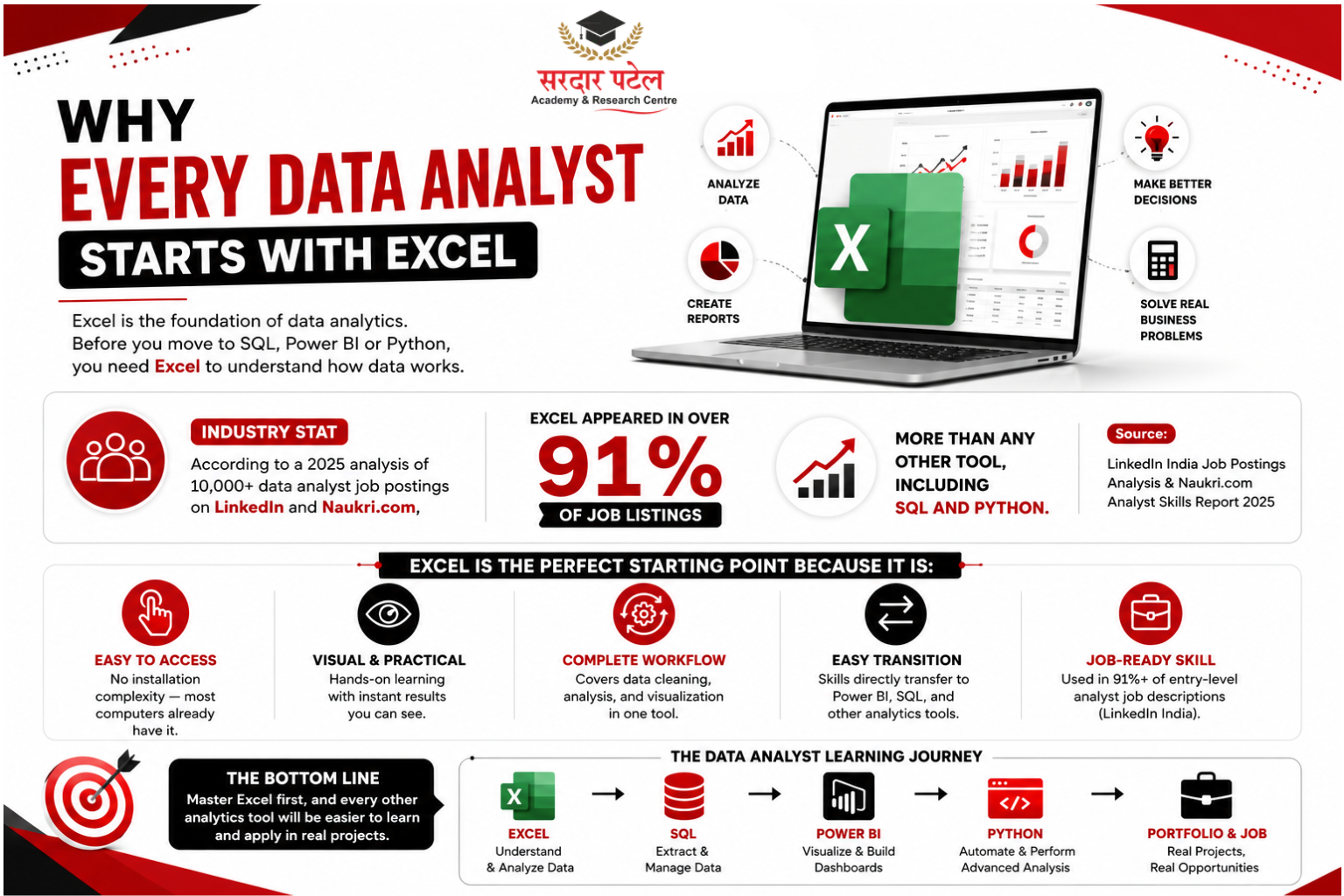
Here is what makes Excel the perfect starting point for beginners:
- No installation complexity — most computers already have it
- Visual, hands-on learning — you see results instantly
- Covers the core analytics workflow — data cleaning, analysis, visualisation
- Directly transfers to Power BI and other BI tools
- . Used in 91%+ of entry-level analyst job descriptions (LinkedIn India, most recent available data)
When you master Excel first, learning SQL, Python, or Power BI becomes significantly easier — because you already understand what analysis is supposed to do.
Getting Started: Understanding the Excel Interface. Before you analyse anything, you need to get comfortable with where things are. The Excel interface has three key areas you will use constantly.
The Ribbon:
The ribbon runs across the top and contains all of Excel's tools organised into tabs: Home, Insert, Formulas, Data, Review, and View. As a beginner, you will spend most of your time in Home (for formatting), Formulas (for calculations), and Data (for sorting, filtering, and cleaning).
Cells, Rows, and Columns:
Excel organises everything into a grid. Each rectangle is a cell, identified by its column letter and row number — so A1 is the first cell, B3 is column B, row 3. Every formula and function you write will reference cells this way.
The Formula Bar:
Click any cell and look at the formula bar at the top. It shows exactly what's inside that cell — a number, text, or a formula. This is where you'll type your formulas when you want more control than clicking around the ribbon.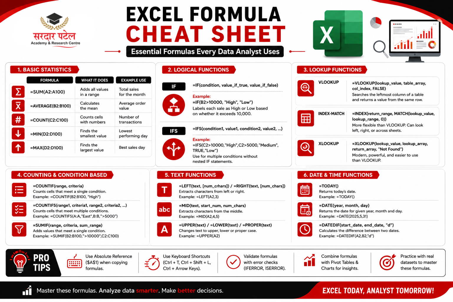
| QUICK TIP: Press Ctrl+End to jump to the last used cell in your sheet. This instantly shows the size of your dataset before you start working. |
Essential Excel Formulas Every Data Analyst Uses
Formulas are the engine of Excel. As a beginner in Excel for data analytics, these are the functions you will use in almost every project.
SUM, AVERAGE, COUNT, MIN, MAX.
These five functions cover the basic descriptive statistics that every analyst needs. They answer simple but critical questions about your data.
| Formula |
What It Does |
Example Use |
| =SUM(A2:A100) |
Adds all values in a range |
Total sales for the month |
| =AVERAGE(B2:B100) |
Calculates the mean |
Average order value |
| =COUNT(C2:C100) |
Counts cells with numbers |
Number of transactions |
| =MIN(D2:D100) |
Finds the smallest value |
Lowest performing day |
| =MAX(D2:D100) |
Finds the largest value |
Best sales day |
IF and IFS
The IF function lets you add logic to your analysis. It checks a condition and returns one value if true, another if false.
Basic syntax: =IF(condition, value_if_true, value_if_false)
Example: =IF(B2>10000, "High", "Low") — labels each sale as High or Low based on whether it exceeds 10,000.
For multiple categories, use the IFS() function (available in Excel 2019+), which is cleaner than nesting multiple IF statements inside each other.
VLOOKUP and INDEX-MATCH.
These are lookup functions — they find information in one table and pull it into another. Every data analyst uses them constantly when working with multiple data sources.
- VLOOKUP: =VLOOKUP(lookup_value, table_array, col_index, FALSE) — searches the leftmost column of a table and returns a value from the same row in a specified column.
- INDEX-MATCH: =INDEX(return_range, MATCH(lookup_value, lookup_range, 0)) — more flexible than VLOOKUP. Can look left, right, or across multiple sheets without the column number limitation.
- XLOOKUP: =XLOOKUP(lookup_value, lookup_array, return_array) — the modern replacement for VLOOKUP (Excel 365 and Excel 2021+). Simpler syntax, no column numbers needed, and searches in any direction.
As your datasets grow larger, you'll eventually move beyond spreadsheets and start working with databases. That's where SQL becomes an essential skill for every data analyst. If you're ready for the next step after Excel, explore our SQL Basics Tutorial for Students to learn how SQL queries help retrieve, filter, and analyse data efficiently.
| PRO TIP: Most experienced analysts prefer INDEX-MATCH over VLOOKUP because it does not break when you insert columns into your table. If you are on Excel 365, learn XLOOKUP — it combines the best of both. |
COUNTIF and SUMIF.
These conditional versions of COUNT and SUM are essential for segmented analysis.
- =COUNTIF(range, criteria) — counts cells that meet a condition. Example: =COUNTIF(D2:D500, "Delhi") counts how many orders came from Delhi.
- =SUMIF(range, criteria, sum_range) — adds values where a condition is met. Example: =SUMIF(D2:D500, "Delhi", E2:E500) totals sales only from Delhi.
TEXT Functions.
Real-world data is messy. Text functions help you clean and standardise it.
- =TRIM(A2) — removes extra spaces from the beginning, end, and middle of text
- =UPPER(A2) / =LOWER(A2) — standardizes text case across the column
- =LEFT(A2, 5) / =RIGHT(A2, 4) / =MID(A2, 3, 6) — extracts substrings from text
- =CONCATENATE(A2, " ", B2) or =A2&" "&B2 — joins text from multiple cells
Want to Go From Formulas to Job-Ready? Learn Excel, SQL, Power BI & Python with live projects and expert mentors at Sardar Patel Academy (SPARC).
Explore the SPARC Data Analytics Program → 📞 Call: +91 93129-66129 📧 Email: sparc.dm@gmail.com |
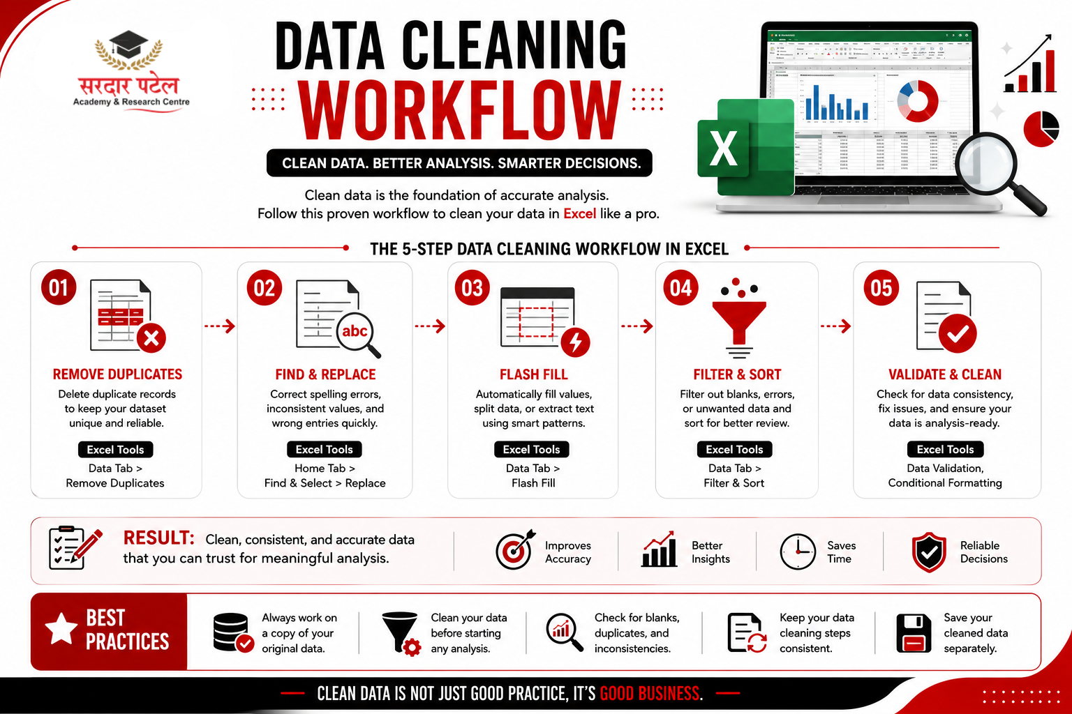
Data Cleaning in Excel: The Skill That Sets Analysts Apart.
Here is something most tutorials skip: industry experts estimate that 60-80% of an analyst's time is spent cleaning data, not analysing it. Raw data from real business systems is almost always messy.
Learning to clean data in Excel prepares you for the reality of the job far better than memorising 50 advanced formulas.
Remove Duplicates.
Go to the Data tab > Remove Duplicates. Excel will scan your selected columns and remove rows where all selected values match.
| IMPORTANT: Always create a backup copy of your sheet before removing duplicates. This operation permanently deletes rows and cannot be undone with Ctrl+Z once the file is saved. |
Find and Replace
Ctrl+H to open Find and Replace. Use it to standardise inconsistent values — for example, replacing "delhi", "Delhi " (with trailing space), and "DELHI" all with a clean "Delhi". This is one of the fastest cleaning operations in Excel.
Flash Fill
(Ctrl+E) is one of Excel's most underrated features. Type the desired output for the first row, then press Ctrl+E — Excel detects the pattern and fills the rest automatically.
Example: If column A has full names like "Rohit Sharma" and you type "Rohit" in B1, Flash Fill will extract all first names in column B automatically. It works for reformatting phone numbers, extracting zip codes, or splitting any structured text.
Filter and Sort:
Before analysing anything, always filter and sort your data to check for blanks, obvious errors, and outliers. Click any cell in your data > Data tab > Filter. Dropdown arrows appear in each column header — use these to scan each column and spot problems before they affect your analysis.
Pivot Tables: The Most Powerful Feature in Excel for Data Analytics
If there is one single feature that separates analysts who can actually answer business questions from those who just know formulas, it is pivot tables.
A pivot table lets you summarise thousands of rows of data in seconds — grouping, counting, summing, and filtering without writing a single formula. They are fast, flexible, and the closest Excel comes to a real analytics query tool.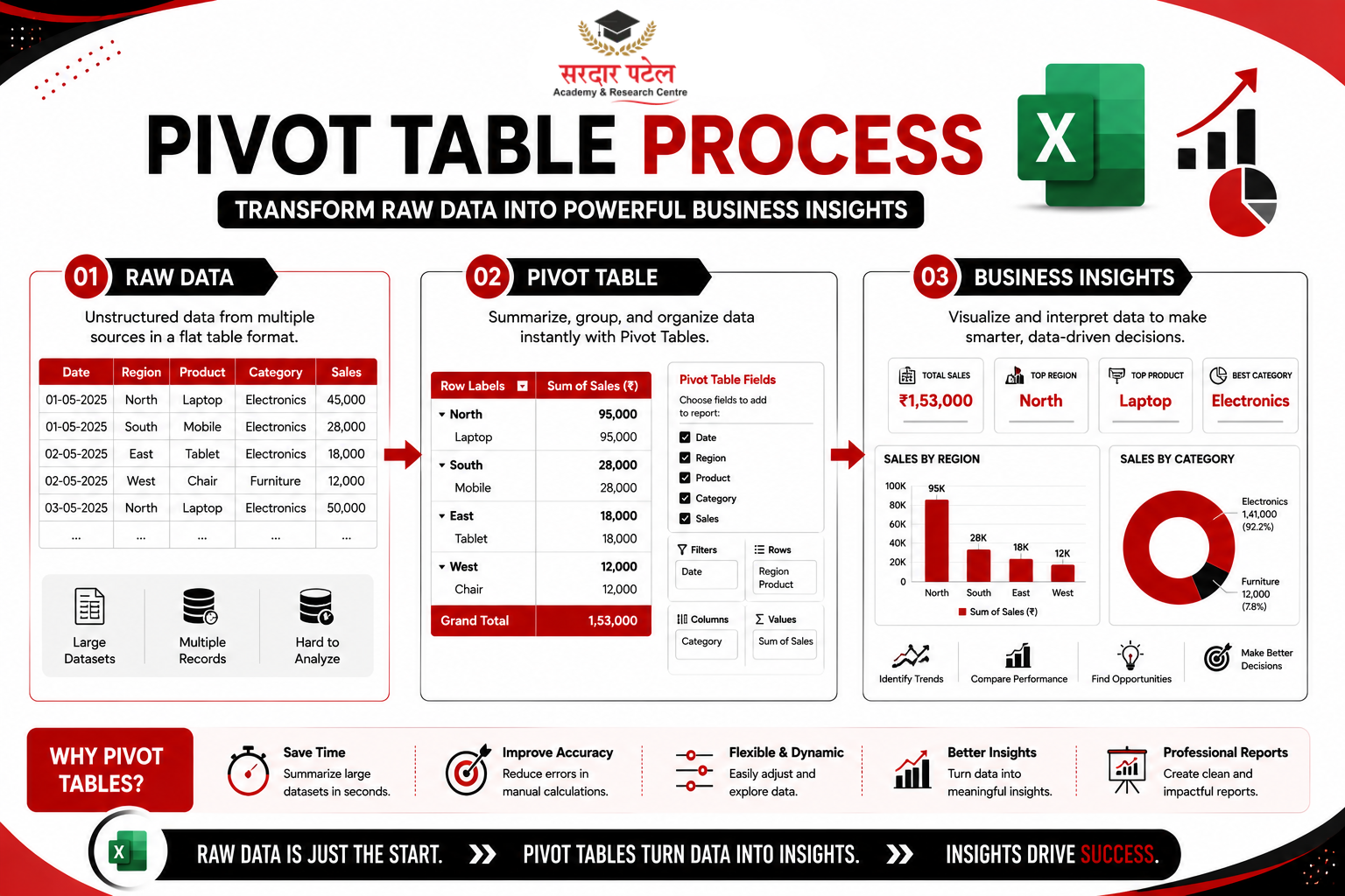
How to Create a Pivot Table
- Click anywhere inside your data
- Go to the Insert tab > PivotTable
- Choose where to put it — a new sheet is usually cleaner
- In the PivotTable Fields panel on the right, drag fields to the four areas:
- Rows: What you want to group by (e.g., Region, Product Category, Month)
- Values: What you want to calculate (e.g., Sum of Sales, Count of Orders)
- Columns: Optional second grouping for side-by-side comparison
- Filters: Add a slicer to filter the whole table by a single field
| ℹ️ IN PRACTICE Real example: Drag 'Region' to Rows and 'Revenue' to Values. Excel instantly shows total revenue by region across your entire dataset — a query that would take hours to do manually. |
Calculated Fields in Pivot Tables: You can add custom calculations inside a pivot table without touching the source data. Go to PivotTable Analyze tab > Fields, Items & Sets > Calculated Field. This lets you create metrics such as average order value, profit margin percentage, or revenue per unit — all of which update dynamically as your data changes.
Data Visualisation in Excel: Turning Numbers into Insight.
Numbers in a spreadsheet are difficult for most people to interpret. Charts and dashboards convert data into visual stories that stakeholders can understand at a glance. This is a core skill for any data analyst — and Excel's charting tools are powerful enough to produce professional-quality output.
Choosing the Right Chart Type
| Chart Type |
Best Used For |
Example |
| Column / Bar |
Comparing categories |
Sales by region |
| Line |
Showing trends over time |
Monthly revenue growth |
| Pie / Doughnut |
Parts of a whole (use sparingly) |
Market share breakdown |
| Scatter |
Correlation between two variables |
Ad spend vs. revenue |
| Combo |
Two different metrics on one chart |
Revenue + Growth % |
To create a chart: select your data range, go to the Insert tab, and choose your chart type. Then format it — change colours, add data labels, adjust axis titles, and remove unnecessary gridlines for cleaner, more professional output.
Building a Basic Dashboard.
A dashboard is a collection of charts and summary metrics on a single sheet that gives a complete picture of performance. Here is how to build one in Excel: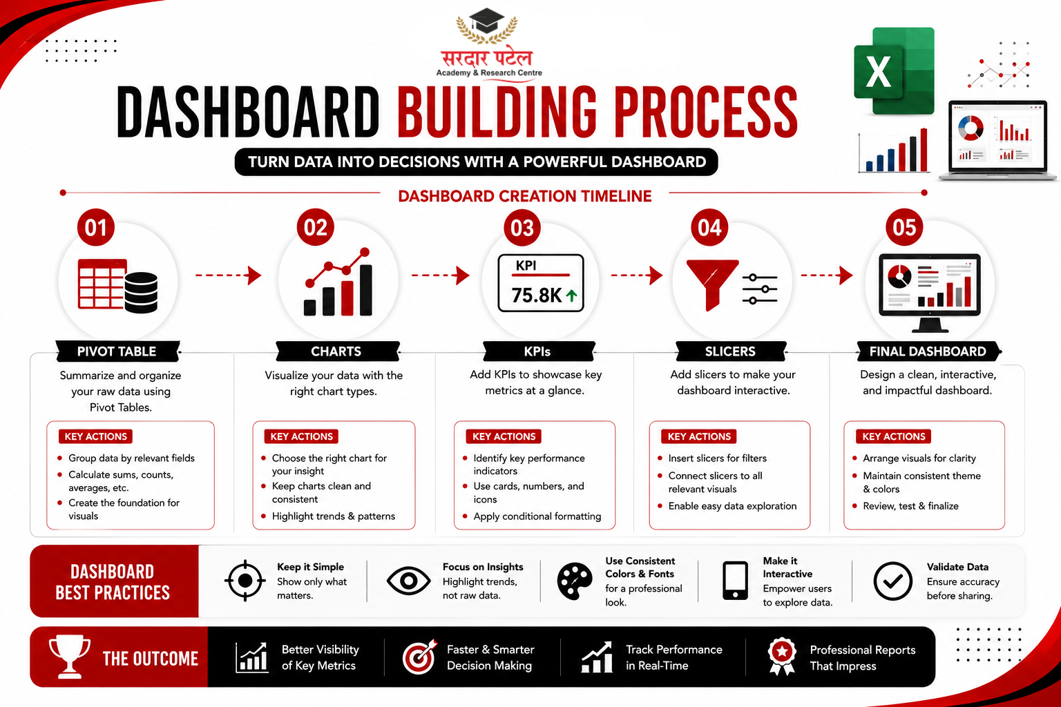
Create your pivot tables and charts on separate sheets
- Create a new blank sheet called 'Dashboard'
- Copy charts and paste them as 'Linked Picture' so they update automatically
- Add key KPI metrics using large-font cells at the top
- Use Slicers (Insert > Slicer) connected to your pivot tables for interactive filtering
Many organisations also build collaborative dashboards using Google Sheets. Read our Beginner Guide to Business Intelligence to learn how cloud-based spreadsheets can complement your Excel skills.
Even a simple dashboard with three charts and a few KPI numbers looks professional and communicates far more than raw data alone.
Your First Excel Analytics Project: Step-by-Step
Theory is useful, but real learning happens when you apply it. Here is a practical mini-project you can complete in 60-90 minutes using sample sales data. Search 'Superstore dataset Excel' — it is freely available on Kaggle and other platforms.
The Business Questions
Which product category generates the most revenue?
Which region underperforms compared to others?
Are there seasonal patterns in monthly sales?
Step 1: Import and Explore.
Open the dataset. Press Ctrl+End to see how large it is. Scroll through each column to understand what data you have. Use the Filter tool to check for blanks in each column.
Step 2: Clean the Data.
Use TRIM() on all text columns. Run Remove Duplicates (after making a backup). Standardise any inconsistent values in category or region columns using Find and Replace.
Step 3: Build Pivot Tables.
Create three pivot tables: revenue by category, revenue by region, and monthly revenue trend. Each should take under two minutes once you are comfortable with the interface.
Step 4: Visualise.
Build a column chart for category revenue, a bar chart for region comparison, and a line chart for the monthly trend. Keep formatting clean and remove chart junk (unnecessary gridlines, 3D effects, decorative borders).
Step 5: Build Your Dashboard.
Put everything on one sheet. Add a title, your three charts, and three KPI numbers (Total Revenue, Best Region, Best Category). Add slicers for Year and Category so the whole dashboard filters interactively.
| PORTFOLIO TIP: When you finish, document the business questions you answered and the insights you found. This is what interviewers want to hear about — not the formulas you used, but the conclusions you reached. |
One of our students at SPARC, Kavya — a B.Com graduate with no technical background — built her first Superstore dashboard in week 3 of training. That single project, with documented business insights, became the first thing she showed in her interview. She was placed as a Reporting Analyst within two months of completing the course.
Excel Skills Checklist for Aspiring Data Analysts
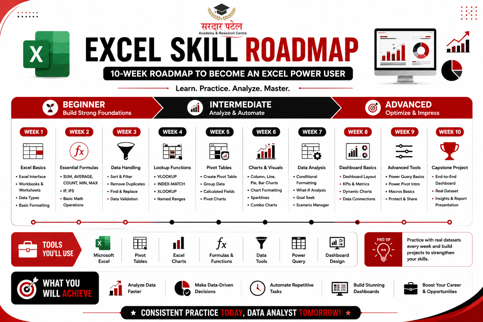
| Level |
Skills to Master |
Suggested Timeline |
| Beginner |
SUM, AVERAGE, COUNT, IF, basic sorting and filtering, simple charts |
Week 1-2 |
| Intermediate |
VLOOKUP, INDEX-MATCH, COUNTIF, SUMIF, Pivot Tables, data cleaning techniques |
Week 3-5 |
| Advanced |
Dashboard building, Power Query, Slicers, XLOOKUP, advanced charting, Calculated Fields |
Week 6-10 |
Common Excel Mistakes Beginners Make (And How to Avoid Them)
Mistake 1: Not Saving a Backup Before Cleaning Data.
Always duplicate your sheet before removing duplicates or running Find and Replace. One wrong move deletes data permanently. Right-click the sheet tab > Move or Copy > check 'Create a Copy'.
Mistake 2: Using Merged Cells in Data Tables.
Merged cells break sorting, filtering, and pivot tables. Use 'Centre Across Selection' instead (Format Cells > Alignment tab) for visual centring without the functionality problems.
Mistake 3: Hardcoding Numbers in Formulas.
Writing =A2+500 is fragile. If the business logic changes, you have to find every hardcoded number manually. Reference cells instead — put the constant in a dedicated cell and reference it, so one change updates everything.
Mistake 4: Skipping Data Validation Before Analysis.
Before analysing, always check: are your dates formatted as actual dates (not text)? Do your numeric columns contain any hidden text values? Filter each column and look at the bottom of the dropdown list for blanks or error values.
Mistake 5: Overcomplicating Charts.
A clean, simple column chart communicates better than a 3D pie chart with 15 colour segments. Remove everything that doesn't add meaning — excess gridlines, decorative shadows, unnecessary legends. Simplicity is a design skill.
| 👉 Explore the SPARC Data Analytics Program Today → 📞 Call: +91 93129-66129 📧 Email: sparc.dm@gmail.com 📝 Scholarship Application Form: https://www.sparc.org.in/download/admission-form |
Ready to Go Beyond Excel?
Join our Data Analytics Course to learn Advanced Excel, SQL, Power BI, Tableau, Python, and work on real-world projects with placement support.
Sources & References
- LinkedIn India Job Postings Analysis, most recent available data — Excel skill frequency in data analyst listings
- Naukri.com Analyst Skills Report, 2025 — India-specific data analyst hiring trends
- Microsoft Excel Official Documentation, 2026 — Formula and feature reference.
- NASSCOM India Analytics Workforce Report, 2024 — Analytics talent demand in India
Conclusion:
Excel is not just a beginner's tool — it is a professional tool that data analysts use throughout their careers. Mastering this Excel tutorial for data analytics gives you the foundation you need to analyse real data, build dashboards, and communicate insights clearly.
The path is straightforward: learn the essential formulas, get comfortable with pivot tables, practice data cleaning on messy real-world datasets, and build at least one dashboard project you can show in an interview. These skills alone will prepare you for the majority of entry-level analyst roles in any industry.
Data analytics is a learnable skill. Excel is where that learning starts. Begin today, practice consistently, and within two to three months, you will be analysing data with genuine confidence.
Ready to build a career in analytics? Visit SPARC to explore our industry-focused training programs, upcoming batches, and placement support.
FAQs
Absolutely. Excel is specifically designed to be approachable for complete beginners. Start with the basic formulas — SUM, AVERAGE, IF — and build from there. Most beginners can comfortably handle real datasets within two to three weeks of consistent practice.
With 1-2 hours of daily practice, most beginners reach a job-ready level of proficiency in 6-10 weeks. The key is working with real datasets from the beginning rather than just watching tutorials passively.
Yes, for most people. Excel teaches you the fundamentals of data analysis — what cleaning looks like, how aggregation works, why visualization matters — in a visual environment where you can see exactly what is happening. That foundation makes SQL and Python significantly easier to pick up afterward.
Absolutely. According to the LinkedIn India Job Postings Analysis (most recent available data) and the Naukri.com Analyst Skills Report 2025, Excel appears in over 91% of analyst job listings. Even at companies that use Python and SQL extensively, Excel is used daily for ad hoc analysis, reporting, and communication with non-technical stakeholders.
Excel is a general-purpose spreadsheet tool with strong analytics capabilities. Power BI is a dedicated business intelligence platform built specifically for interactive dashboards and large-scale reporting. Many analysts use both: Excel for ad hoc analysis and data cleaning, and Power BI for ongoing dashboards and stakeholder presentations.
Pivot tables, by a wide margin. Every experienced analyst uses them constantly. After pivot tables, VLOOKUP/INDEX-MATCH and COUNTIF/SUMIF are the most frequently used skills in day-to-day analyst work.
No. Basic arithmetic and an understanding of concepts like average, percentage, and comparison are sufficient to handle most entry-level analyst work in Excel. Statistical knowledge helps as you advance, but is not required to get started.