+91 9312966129
 sparc.enquiry01@gmail.com


Power BI Dashboard Tutorial
Build your first interactive Power BI dashboard with this free, step-by-step tutorial using a real dataset and beginner-friendly DAX tips.

Table of Contents
- What Is Power BI?
- Why Learn Dashboard Development?
- Stronger Career Prospects:
- A Genuinely Low Barrier to Entry:
- Real Interactivity, Not Static Reports:
- Connects to Almost Any Data Source:
- Reports vs. Dashboards: What's the Difference?
- What You Need Before You Start
- The 7-Step Dashboard Workflow
- Step 1: Import Your Data
- Step 2: Clean and Transform Your Data
- Step 3: Build Relationships Between Tables
- Step 4: Build Your First Visualisations
- Step 5: Add Slicers for Interactivity
- Step 6: Set Up Key Performance Indicators (KPIs)
- Step 7: Design a Professional Layout
- Choosing the Right Chart for the Job
- Common Mistakes Beginners Make
- Advanced Techniques Worth Learning Next
- Pre-Publish Checklist
- A Worked Example
- Final Thoughts
Creating interactive dashboards is one of the most valuable skills in today's data-driven workplace. Whether you're analysing sales, tracking marketing campaigns, monitoring business performance, or preparing reports for management, Power BI helps you turn raw data into meaningful insights. What is Data Analytics? Data Analytics Beginner Guide
This guide walks complete beginners through the entire process of building a dashboard from scratch — using a real sample dataset, practical examples, and industry best practices. By the end, you'll know how to import data, clean it, build relationships, design visuals, and avoid the mistakes that trip up most first-time dashboard builders.
What Is Power BI?
Power BI is Microsoft's business intelligence and data visualisation platform. It transforms raw spreadsheets into interactive reports and dashboards, replacing endless rows of numbers with charts, maps, cards, and tables that are far easier to read at a glance.
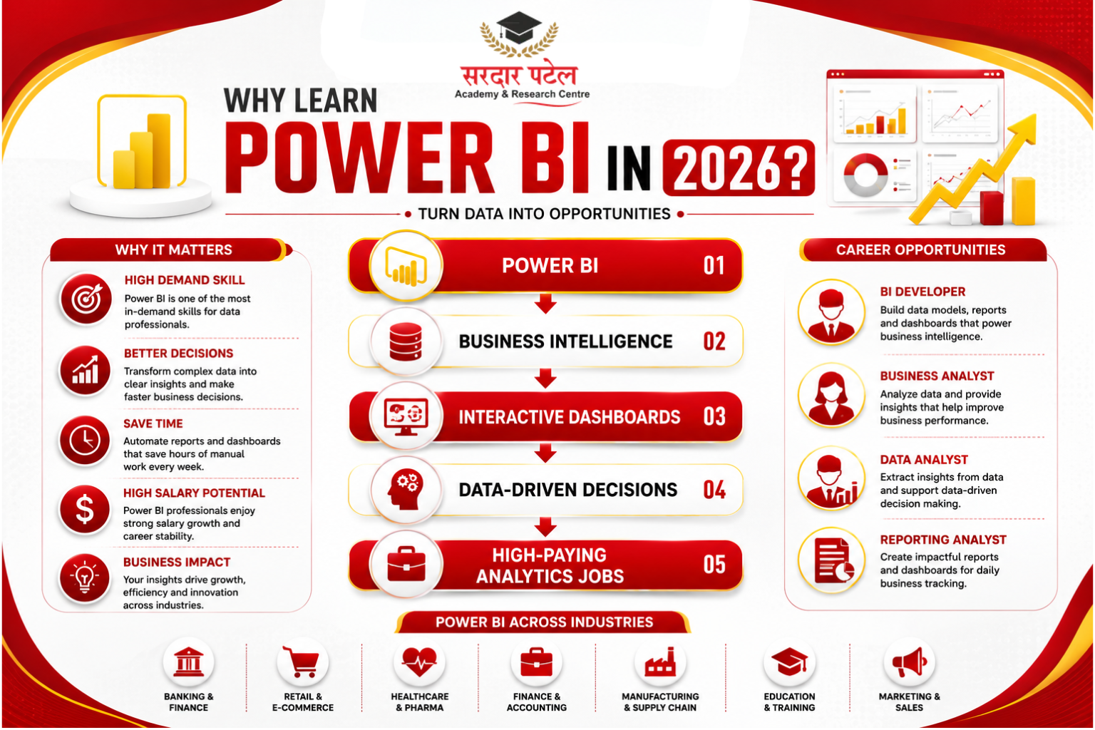
Organisations across banking, retail, healthcare, and logistics increasingly rely on the tool to make faster, evidence-based decisions — largely because it doesn't require a programming background to get started. Top Data Analytics Tools, Essential Analytics Tools
Common business use cases include:
- Monitoring sales and revenue performance
- Tracking marketing campaign ROI
- Analysing customer behaviour
- Measuring employee productivity
- Reviewing financial statements
- Managing inventory levels
- Building executive-level summary dashboards
Why Learn Dashboard Development?
Stronger Career Prospects:
Roles such as Data Analyst, Business Analyst, MIS Executive, Reporting Analyst, and BI Developer increasingly list dashboarding as a core requirement rather than a bonus skill. Data Analytics Basics: Learn Data Analytics from Scratch. If you're weighing this as a career path, see our Power BI Developer Career Scope guide.
A Genuinely Low Barrier to Entry:
The drag-and-drop interface means you don't need to write code to produce your first working report. That said, learning a little DAX (covered later) unlocks far more powerful dashboards.
Real Interactivity, Not Static Reports:
Where a traditional Excel report goes stale the moment new data arrives, Power BI dashboards offer dynamic filters, drill-downs, and live KPI scorecards that update instantly.
Connects to Almost Any Data Source:
Excel, SQL Server, MySQL, CSV files, SharePoint, Azure, Google Analytics, web APIs, and cloud databases can all feed into a single dashboard — which is exactly why it's become a default choice across
Reports vs. Dashboards: What's the Difference?
Beginners often use these terms interchangeably, but they serve different purposes.
A simple way to remember it: a report is the full book, and a dashboard is the one-page summary.
What You Need Before You Start
Power BI Desktop — free to download from Microsoft's official site.
A practice dataset — sales records, retail orders, or customer data works well for following along.
Basic spreadsheet familiarity — knowing what a table, filter, sort, or pivot table does will speed things up, though it isn't mandatory.
A clear business question — before opening any software, ask: What problem am I solving? Who will actually use this dashboard? Which 4–6 metrics matter most? Skipping this step is one of the most common reasons dashboards end up cluttered and unused.
The 7-Step Dashboard Workflow
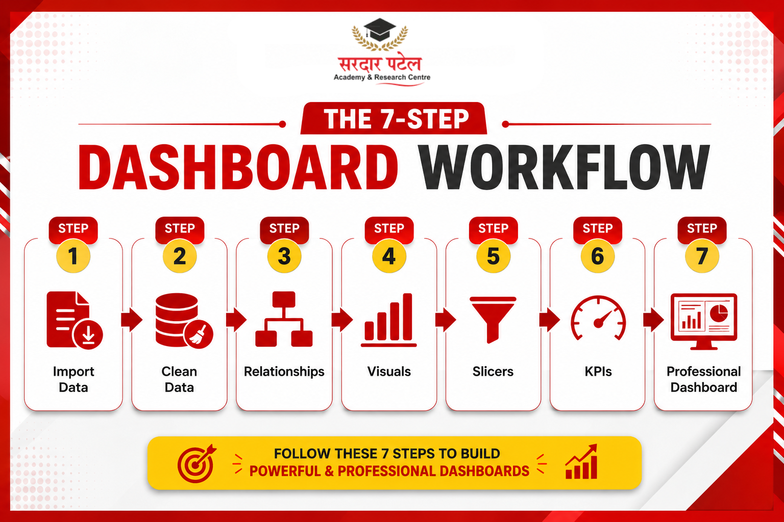
Step 1: Import Your Data
- Open Power BI Desktop.
- Click Get Data.
- Choose your source (Excel, CSV, SQL Server, etc.).
- Browse to your file and select it.
- Click Load — or Transform Data if the file needs cleaning first.
Choosing Transform Data opens the Power Query Editor, where you'll prepare the dataset before building any visuals. This step matters more than people expect: a dashboard built on messy data will produce confidently wrong numbers.
Step 2: Clean and Transform Your Data
Power Query Editor lets you fix data issues without writing code. Typical cleanup tasks include:
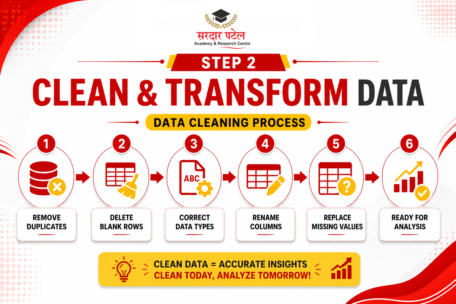
- Removing duplicate rows
- Deleting blank rows or columns
- Correcting data types (text vs. date vs. number)
- Renaming unclear column headers
- Replacing missing values
- Splitting or merging columns
- Filtering out irrelevant records
Example: in a retail sales file, you might find rows with missing customer names or inconsistent date formats (01/02/2026 vs. 2026-02-01). Standardising these before visualisation prevents charts from silently misreporting totals.
Step 3: Build Relationships Between Tables
Real business data rarely lives in one spreadsheet. You'll typically work with separate Customers, Orders, Products, and Sales tables. Rather than merging them manually, Power BI lets you define relationships between tables in Model View.
Relationship types you'll encounter:
- One-to-One
- One-to-Many
- Many-to-One
Skipping this step causes real problems: filters stop working correctly, visuals show duplicated values, and KPIs become inaccurate. Always check Model View before moving on to visualisation.
Once you're comfortable with Power BI, the next step is learning SQL for querying databases and Python for advanced data analysis and automation. If you're unsure which skill to learn first, read our detailed guide on SQL vs Python for Analytics Career to choose the right learning path based on your career goals.
Step 4: Build Your First Visualisations
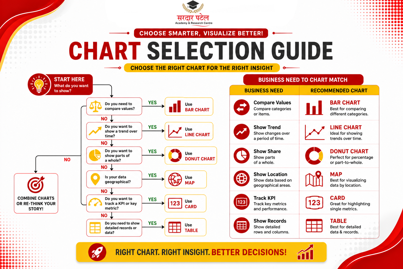
This is where raw numbers start becoming insight. Power BI's visual library includes bar charts, column charts, line charts, pie and doughnut charts, tables, matrices, maps, cards, KPI indicators, and scatter charts.
A typical sales dashboard might combine:
- Total Sales (Card)
- Total Profit (Card)
- Monthly Revenue Trend (Line Chart)
- Top-Selling Products (Bar Chart)
- Sales by Region (Map)
Every visual should answer a specific business question — if you can't say what question a chart answers, it probably doesn't belong on the dashboard.
Step 5: Add Slicers for Interactivity
Slicers let users filter the entire dashboard without you having to build separate reports for every scenario. Common slicers include date range, region, product category, customer segment, and sales representative.
Example: A manager wants to see sales for North India in the last quarter. Instead of requesting a new report, they adjust two slicers, and every visual on the page updates instantly.
Step 6: Set Up Key Performance Indicators (KPIs)
KPIs are the numbers decision-makers look at first, before digging into detailed charts. Strong candidates include total revenue, total profit, month-over-month growth, customer count, average order value, target achievement percentage, and return rate.
Display these using Card visuals, positioned at the top of the dashboard so they're the first thing a viewer sees.
Related read: KPI Dashboard Tutorial
Step 7: Design a Professional Layout
A dashboard succeeds or fails on usability, not just accuracy. A few layout principles make a measurable difference:
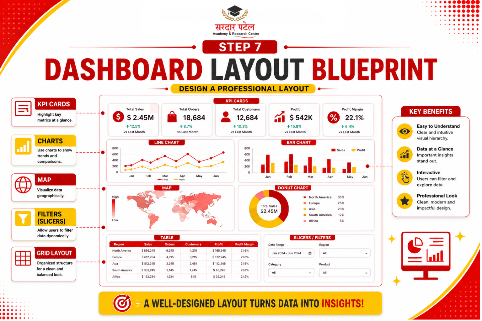
Keep it focused. Aim for 5–8 visuals total — overcrowding defeats the purpose of a dashboard.
Limit your colour palette. Two or three core colours, plus one accent colour for highlights, read as more professional than a rainbow of chart colours.
Align everything. Equal spacing and grid alignment make a dashboard feel intentional rather than thrown together.
Put KPIs at the top. Users read top-to-bottom, so summary cards belong above detailed charts.
Write specific titles. "Monthly Sales Performance (2026)" tells the viewer more than a generic "Sales Chart."
Want to go from dashboards to job-ready? Learn Power BI, SQL, and Excel hands-on with SPARC's data analytics program — real datasets, mentor feedback, and portfolio-ready projects.
👉 Explore the SPARC Data Analytics Course
Choosing the Right Chart for the Job
Common Mistakes Beginners Make
- Overloading the dashboard with visuals. More charts rarely mean more insight — it usually means more confusion. Keep only the visuals that answer a real business question.
- Skipping the data-cleaning step. Dashboards built on unclean data look polished but report incorrect numbers, which is worse than no dashboard at all.
- Picking the wrong chart type. A pie chart with twelve slices is harder to read than a simple bar chart — match the visual to the question, not to what looks impressive.
- Using too many colours. Inconsistent or overly bright colour schemes distract from the data itself rather than highlighting it.
- Skipping interaction testing. Before sharing a dashboard, click through every slicer, filter, and drill-through page yourself, and check how it renders on mobile.
Advanced Techniques Worth Learning Next
Once the basics feel comfortable, these features add real depth to your dashboards:
Bookmarks let users switch between different saved dashboard views.
Drill-through pages — clicking a summary chart opens a detailed page for that specific item.
Custom tooltips — show extra context when a user hovers over a data point.
Dynamic titles — titles that update automatically based on the filters selected.
Basic DAX (Data Analysis Expressions) is used for calculations like year-to-date sales, running totals, profit margin, and growth percentage. This is usually the natural next step after you've built a few dashboards manually.
Pre-Publish Checklist
Before sharing a dashboard with stakeholders, confirm:
- Data is clean and accurate
- Table relationships are correctly modelled
- KPIs are clearly visible near the top
- Every chart answers a specific business question
- The dashboard loads without lag
- Slicers and filters work as expected
- Titles are descriptive, not generic
- Colours are limited and consistent
- Mobile view has been tested
- A first-time viewer can understand it without explanation
A Worked Example
Picture a dashboard built for an online retail company, showing:
- Total Sales: ₹82,50,000
- Profit Margin: 24%
- Top Product Category: Electronics
- Highest Revenue State: Maharashtra
- Monthly Sales Trend (line chart)
- Top 10 Customers (table)
- Product-wise Profit Analysis (bar chart)
A manager scanning this dashboard can spot trends in seconds — something that would take much longer to see scrolling through a raw spreadsheet of thousands of rows.
Final Thoughts
Building dashboards is one of the most practical, immediately useful skills in data analytics. Complete Data Analytics Learning Guide: This tutorial walked through the full process — importing and cleaning data, modeling relationships, building visuals, adding interactivity, and applying layout principles that make a dashboard genuinely usable rather than just visually busy.
As you keep practising, the goal isn't to use every chart type Power BI offers — it's to solve specific business questions clearly. The more real datasets you work through, the more natural this process becomes.
Ready to build your first dashboard? Download a free practice dataset and follow along step by step — or book a free 1:1 walkthrough if you'd rather get hands-on guidance from a trainer.
FAQs
No. The drag-and-drop interface means most learners can build a basic working dashboard within a few weeks of consistent practice.
Not for basic dashboards. Learning DAX and Power Query later on does help with more advanced reporting, but it isn't required to get started.
Most people grasp the fundamentals in 4–8 weeks of regular practice. Advanced features, particularly DAX, tend to take a few months to feel comfortable with.
Banking, finance, healthcare, retail, manufacturing, education, marketing, logistics, and IT all use it for KPI tracking and reporting.
Yes — it's a frequently requested skill for Data Analyst, Business Analyst, MIS Executive, Reporting Analyst, and BI Analyst roles. A small portfolio of 2–3 polished dashboards goes a long way in interviews.
A report is a multi-page, detailed document. A dashboard is a single-page summary built around the metrics that matter most to its audience.