+91 9312966129
 sparc.enquiry01@gmail.com


Data Visualization Basics
Learn data visualization basics with easy examples of charts, graphs, and dashboards. A beginner-friendly guide to turning raw data into insights.

Table of Contents
- What Is Data Visualisation?
- Why Is Visualisation Important in Analytics?
- Key Benefits of Data Visualisation
- Makes Complex Data Easy to Understand:
- Helps Find Trends Faster:
- Improves Decision Making:
- Better Communication:
- Saves Time:
- Essential Elements of Good Data Visualisation
- Clear Purpose —
- Know Your Audience —
- Accurate Labels —
- Correct Scale —
- Right Format for the Data —
- Common Types of Charts and Graphs in Analytics
- Bar Chart —
- Line Chart —
- Pie Chart —
- Scatter Plot —
- Histogram —
- Heat Map —
- How to Select the Most Suitable Chart for Your Data
- Data Visualisation Best Practices
- Keep It Simple —
- Use Meaningful Titles —
- Highlight Important Information —
- Maintain Consistent Colours —
- Limit the Number of Categories —
- Use White Space Effectively —
- Tell a Story With Data —
- Common Data Visualisation Mistakes to Avoid
- Using the Wrong Chart Type —
- Overloading the Dashboard —
- Ignoring Labels —
- Misleading Scales —
- Too Many Colours —
- Poor Data Quality —
- Popular Data Visualisation Tools
- Microsoft Excel —
- Power BI —
- Tableau —
- Google Looker Studio —
- Python Visualisation Libraries —
- Real-World Applications of Data Visualisation
- Business Analytics
- Marketing Analytics
- Healthcare
- Education
- Finance
- Practical Example: Turning Data Into Insight
- Learn Visualisation Skills and Build Your Analytics Career
- Conclusion
What Is Data Visualisation?
A spreadsheet with 10,000 rows and a single well-made chart can carry the same information — but only one of them tells you what actually happened in five seconds. That gap is the entire reason visual analytics exists.
Data visualisation is the process of presenting information through visual elements such as charts, graphs, maps, dashboards, and infographics. Instead of reading rows of raw data, people can understand information much faster through visuals.
Whether you're a student, business owner, marketer, or someone exploring what data analytics really means, learning the fundamentals of visualisation will help you communicate information clearly and make better decisions.
Modern companies produce large volumes of data through their daily operations. IDC's Data Age 2025 whitepaper projected that the global datasphere would reach 175 zettabytes by 2025 — a milestone that has since passed, underscoring just how valuable visualisation skills have become for making sense of that scale of data. Without proper visuals, even the best data can lose its impact.
In this guide, you'll learn the core concepts, walk through the most common charts and graphs used in analytics, pick up practical design best practices, and see the tools professionals rely on to build meaningful dashboards.
Read: Power BI Dashboard Tutorial
Why Is Visualisation Important in Analytics?
Imagine your company tracks monthly sales for five years.
If someone hands you a spreadsheet containing 60 rows of numbers, identifying the highest sales month or spotting seasonal trends may take several minutes.
The same information becomes much easier to interpret when shown in a line chart.
Within seconds, you can instantly identify:
- Growth trends
- Seasonal patterns
- Sudden drops
- Peak performance months
- Business opportunities
That's the power of visualisation. Humans process images much faster than text, which makes charts one of the easiest ways to communicate complex information. This is also one of the key steps in the data science process — raw data is cleaned, analysed, and finally visualised so decision-makers can act on it.
Read: SQL vs Python for Analytics Career
Read: KPI Dashboard Tutorial to learn how to turn key performance indicators into an interactive business dashboard.
Key Benefits of Data Visualisation
Getting comfortable with charts and dashboards pays off for students, professionals, and businesses alike. It's a core reason data analytics is essential for business today.
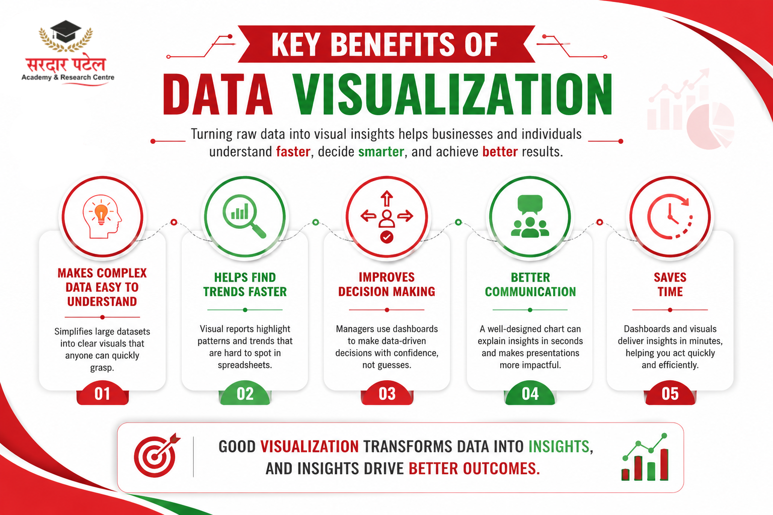
Makes Complex Data Easy to Understand:
Large datasets often contain thousands of rows. Visualisations simplify this information into clear patterns that anyone can understand. For example, instead of reading customer purchase data for an entire year, a bar chart can instantly show which month had the highest sales.
Helps Find Trends Faster:
Visual reports reveal patterns that are difficult to notice in spreadsheets — sales growth, customer behaviour, website traffic trends, seasonal demand, and product performance.
Improves Decision Making:
Managers rely on dashboards every day. Instead of guessing, they use visual reports to decide on marketing budgets, new product launches, customer service improvements, and inventory management.
Better Communication:
A well-designed chart can explain information in seconds. This is why presentations, business meetings, and reports rely heavily on visualisation.
Saves Time:
Reading reports may take hours. Viewing dashboards often takes only a few minutes, letting businesses react quickly to changing situations.
Essential Elements of Good Data Visualisation
Creating charts isn't enough — good visualisation tells a story. Before you even open a tool, these are the foundational questions and components every chart needs to get right.
Clear Purpose —
Ask yourself: what question should this chart answer? Every chart should solve one problem.
Know Your Audience —
A chart for a company board meeting and one for a classroom assignment require different levels of detail and technical rigour.
Accurate Labels —
Always include a chart title, axis labels, units, and legends where necessary. Missing labels often confuse readers.
Correct Scale —
Never manipulate chart scales to exaggerate results. Accurate scales build trust.
Right Format for the Data —
A chart is only "good" if it matches the underlying data type — categorical, numerical, or time-based — which is exactly what the next section helps you decide.
Common Types of Charts and Graphs in Analytics
One of the most important skills to build here is choosing the right chart, since different visuals answer different questions.

Bar Chart —
Best for comparing categories such as product sales, student marks, or revenue. Example: A store sells 250 laptops, 430 mobile phones, and 170 tablets. Displaying these figures in a bar chart makes it immediately clear that mobile phones have the highest sales.
Line Chart —
Best for monthly sales, stock prices, website traffic, and growth over time. Line charts are excellent for identifying upward or downward trends.
Pie Chart —
Best for showing percentages of a whole, such as market share split across a few companies. Pie charts are most effective when the data contains a limited number of categories.
Scatter Plot —
A scatter plot is useful for examining relationships between two numerical variables, such as student test scores and study hours or marketing budget and total sales.
Histogram —
A histogram illustrates how data is distributed across different value ranges. It is commonly used to analyse information such as customer age groups, employee salary ranges, delivery durations, or product price distributions.
Heat Map —
Uses colours to represent values, such as website click tracking, regional sales performance, or customer activity, quickly highlighting areas that need attention.
How to Select the Most Suitable Chart for Your Data
Selecting the correct chart is one of the most important skills in this entire process. Even accurate data can become confusing when presented in the wrong format.
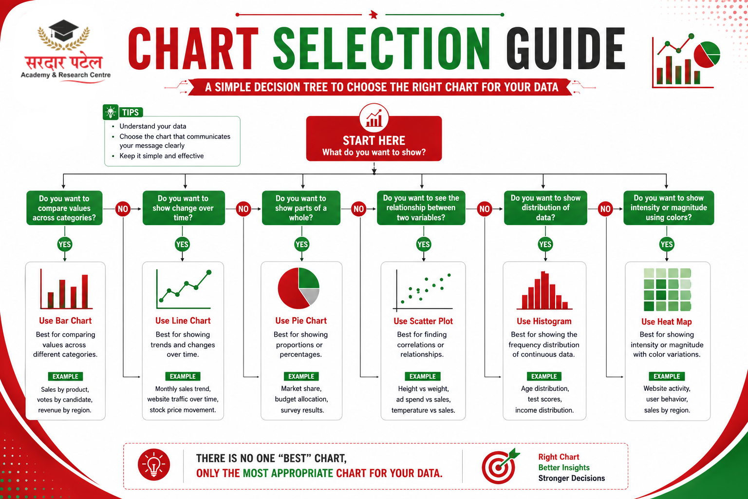
Before creating a chart, ask: What story am I trying to tell? Is my data categorical or numerical? Do I want to show change over time? Am I comparing values or showing proportions? Answering these questions makes chart selection much easier.
Data Visualisation Best Practices
Getting the foundations right is step one — these are the hands-on techniques that turn a technically correct chart into one that's genuinely easy to read.
Keep It Simple —
Avoid too many colours, unnecessary animations, extra shapes, and decorative backgrounds. Use clean layouts, focus on key metrics, and remove visual clutter.
Use Meaningful Titles —
A title like "Sales Report" says little. A title like "Monthly Sales Increased by 28% in Q2" immediately tells readers what matters.
Highlight Important Information —
Guide the viewer's attention with bold colours for key data points, annotations, and callout labels. If one region generated 60% of the revenue, emphasise that region in the chart.
Maintain Consistent Colours —
For example, Revenue = Blue, Expenses = Red, Profit = Green. Using the same colour scheme across reports reduces confusion.
Limit the Number of Categories —
Group small categories together, focus on the most important values, and break large datasets into multiple charts when needed.
Use White Space Effectively —
Crowded dashboards overwhelm viewers. Professional dashboards leave enough space between charts and elements.
Tell a Story With Data —
Instead of just showing January, February, and March sales figures, explain that sales increased steadily during Q1 due to higher demand and successful marketing campaigns. This turns numbers into actionable insight.
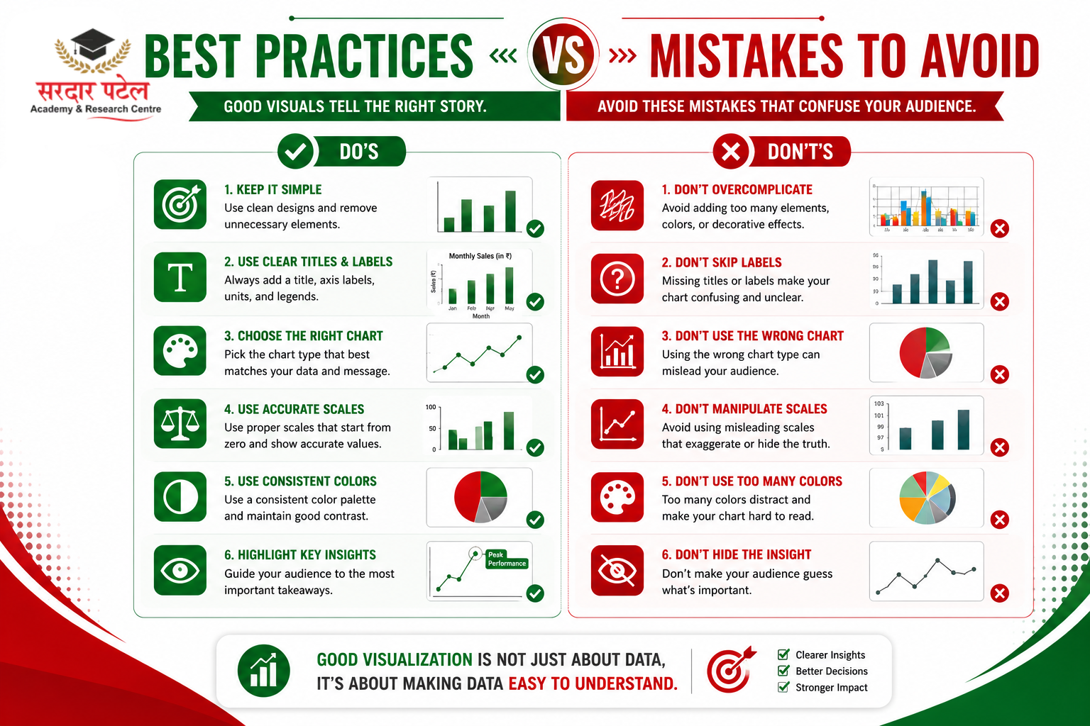
Common Data Visualisation Mistakes to Avoid
Using the Wrong Chart Type —
A pie chart with 20 categories creates confusion; a bar chart communicates the same information far better.
Overloading the Dashboard —
Too many KPIs, visuals, or text make it difficult to identify what actually matters. Focus only on metrics that support decision-making.
Ignoring Labels —
Charts without titles, axis labels, data labels, or legends force viewers to guess.
Misleading Scales —
Starting the Y-axis at 90 instead of 0 can make a small increase look dramatic. Always use honest scaling.
Too Many Colours —
Ten different colours in one chart usually creates confusion. Most professional dashboards stick to three to five primary colours.
Poor Data Quality —
A chart is only as good as the data behind it. Remove duplicates, correct errors, check missing values, and validate calculations before visualising.
Popular Data Visualisation Tools
Today's analysts have access to many powerful platforms.
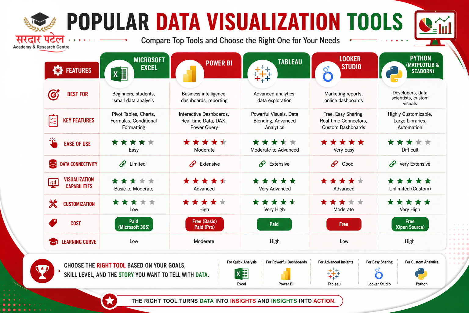
Microsoft Excel —
Easy to learn, with built-in charts, pivot tables, and dashboard creation. Best for students, beginners, and small businesses.
Power BI —
Microsoft's fast-growing analytics platform, known for interactive dashboards, real-time reporting, data modelling, and business intelligence capabilities. Power BI Dashboard Tutorial: Many companies now consider Power BI skills — including DAX, Power Query, and custom visuals — essential for analytics jobs.
Tableau —
Known for its drag-and-drop interface and stunning, interactive visualisations. Best for data storytelling, business intelligence, and executive dashboards. If you're deciding between the two, Power BI is generally the easier and more cost-effective starting point for beginners. At the same time, Tableau is often preferred for advanced, design-heavy dashboards — the classic Power BI vs. Tableau debate analysts often weigh before choosing a tool to specialise in.
Google Looker Studio —
previously Google Data Studio — is free, cloud-based, and connects directly with Google products. Best for digital marketers, website analytics, and SEO reporting.
Python Visualisation Libraries —
Advanced analysts often use Matplotlib, Seaborn, and Plotly for complete customisation and automation in data science projects, machine learning dashboards, and advanced analytics.
If you're planning a career in analytics, it's also important to understand SQL vs Python for an Analytics Career and how both skills fit into different data-related roles.
To see how these tools compare and which one suits your career goals, check out the top data analytics tools you must know.
Real-World Applications of Data Visualisation
Business Analytics
Companies use dashboards to track revenue, expenses, customer acquisition, and profit margins for strategic decisions.
Marketing Analytics
Marketers monitor website traffic, social media engagement, ad performance, and conversion rates to identify successful campaigns quickly.
Healthcare
Hospitals use visualisation to track patient outcomes, disease trends, resource allocation, and treatment effectiveness.
Education
Schools and universities analyse student performance, attendance, and graduation rates to improve teaching strategies.
Finance
Financial institutions monitor investments, market trends, risk analysis, and portfolio performance through simplified charts.
Practical Example: Turning Data Into Insight
Imagine an online store records monthly sales:
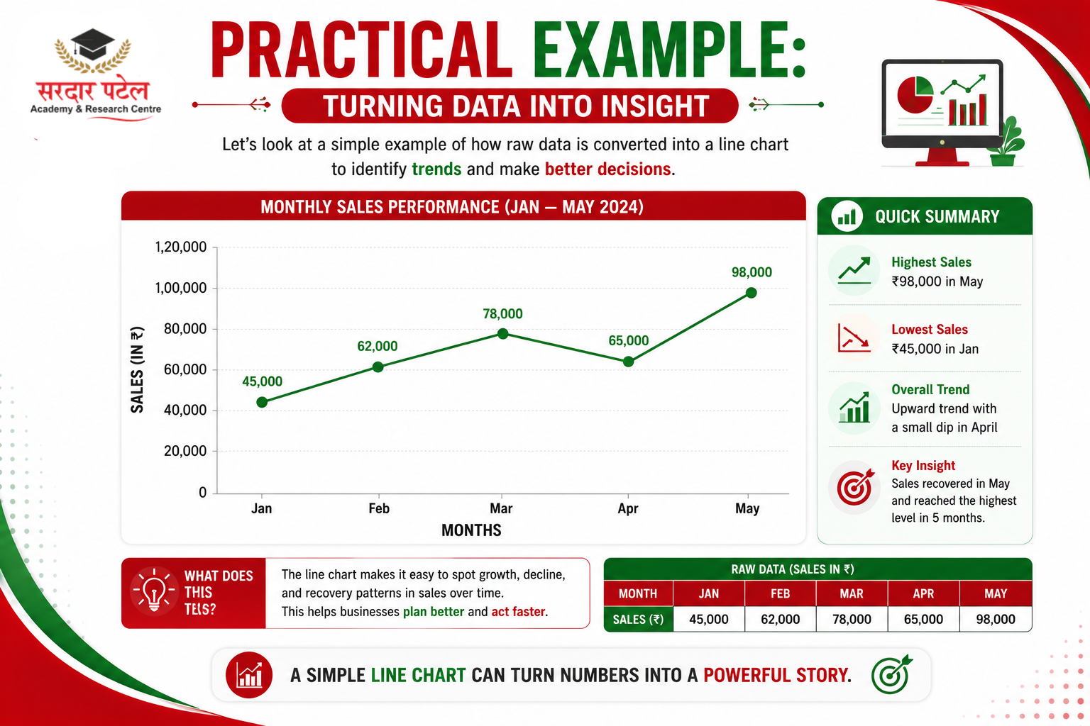
Looking at numbers alone shows growth. However, a line chart instantly reveals a continuous upward trend, consistent performance, and positive business growth — exactly why data visualisation has become a core skill in analytics, and why it's one of the fundamentals covered in any solid data analytics learning guide.
Learn Visualisation Skills and Build Your Analytics Career
Want to create interactive dashboards and professional reports that employers value? Start learning industry-leading tools such as Power BI, Tableau, Microsoft Excel, and Google Looker Studio at Sardar Patel Academy & Research Centre (SPARC).
Enrol in the Data Analytics Course with AI — a project-based program covering Advanced Excel, SQL, Python, Power BI, and Tableau, with 100% placement support, designed for students, working professionals, and business owners across Delhi-NCR.
Conclusion
Learning data visualisation basics is one of the smartest investments you can make if you want to work with data or improve decision-making in any field. A well-designed chart does more than display numbers — it explains trends, highlights opportunities, and communicates insights that are easy to understand. Explore our Data Analytics Course for Beginners →
Whether you're analysing business performance, tracking website traffic, measuring marketing campaigns, or studying customer behaviour, choosing the right charts and graphs in analytics can transform raw data into meaningful stories. By following best practices, avoiding common mistakes, and using the right visualisation tools, you'll be able to present information with clarity and confidence.
Remember, great visualisations aren't about adding more colours or complex designs — they're about making information simple, accurate, and actionable.
FAQs
Data visualization basics involve transforming raw data into visual formats like bar charts, line charts, pie charts, scatter plots, and dashboards. These visuals make it easier to identify patterns, trends, and relationships that may be difficult to notice in spreadsheets.
Data visualisation helps analysts and businesses quickly understand large datasets. Instead of reading thousands of rows of data, decision-makers can use charts and graphs to spot trends, compare performance, and make informed decisions in less time.
Use a bar chart to compare categories, a line chart to show trends over time, a pie chart to show percentages, a scatter plot to show relationships, a histogram to show distribution, and a heat map to highlight patterns and intensity.
Some of the most widely used tools include Microsoft Excel, Power BI, Tableau, Google Looker Studio, and Python libraries like Matplotlib, Seaborn, and Plotly. Each offers different features depending on your experience level and project requirements.
Frequent mistakes include using the wrong chart type, overloading dashboards, choosing distracting colours, missing labels or titles, using misleading scales, and presenting inaccurate or unclean data.
Yes. Beginners can start with tools like Microsoft Excel or Google Looker Studio before progressing to Power BI or Tableau. Learning basic chart selection and design principles is enough to create meaningful visual reports — and a structured data analytics course for beginners can speed this up significantly.
Businesses use visual dashboards to monitor sales, customer behavior, marketing performance, inventory, and financial data. Clear visual reports help teams identify opportunities, solve problems faster, and make data-driven decisions with confidence.