+91 9312966129
 sparc.enquiry01@gmail.com


KPI Dashboard Tutorial
Learn how to build KPI dashboards step by step with real business examples, best practices, and tools. A beginner-friendly KPI dashboard tutorial.

Table of Contents
- What Is a KPI Dashboard?
- Why Are KPI Dashboards Important?
- Benefits of Using KPI Dashboards
- Key Components of an Effective KPI Dashboard
- Types of KPIs You Should Track
- Business KPI Dashboard Examples by Industry
- How to Choose the Right KPIs for Your Dashboard
- Step-by-Step Guide to Building a KPI Dashboard
- Step 1: Define Your Business Objective —
- Step 2: Collect Reliable Data —
- Step 3: Choose the Right KPIs —
- Step 4: Select the Best Visualisations
- Step 5: Design a Clean Layout —
- Step 6: Add Interactive Filters —
- Step 7: Test and Improve —
- KPI Dashboard Design Best Practices
- Common KPI Dashboard Mistakes to Avoid
- Best Tools for Building KPI Dashboards
- Which Tool Should Beginners Choose?
- Conclusion
- Build KPI Dashboards and Advance Your Analytics Skills
What Is a KPI Dashboard?
Imagine walking into a meeting where your manager asks, "How are sales performing this month?" Instead of reviewing data across multiple spreadsheets, a single dashboard brings all your important metrics together in one clear and interactive view. Within seconds, everyone can see revenue, sales growth, customer satisfaction, website traffic, and other important business metrics.
That's the power of a KPI dashboard.
This KPI dashboard tutorial will help you understand what KPI dashboards are, why businesses rely on them, and how you can build one from scratch. Whether you're beginning your data analytics journey, managing business performance, or preparing for a career as a data analyst, learning to build KPI dashboards is a valuable skill that supports smarter decision-making. This builds directly on data visualisation basics, since every dashboard is ultimately made up of the same underlying charts and graphs.
A Key Performance Indicator (KPI) is a measurable value that shows how effectively a company, department, or individual is achieving a specific goal. A KPI dashboard brings all these important metrics together in one place, making it easier to monitor performance and make informed decisions.
Modern businesses collect and process larger volumes of data than ever before, making effective data management more important than ever. At a recent Gartner Data & Analytics Summit keynote, research VP Gareth Herschel stressed that prioritising data-driven decision-making has become essential for organisations navigating fast-changing markets. Well-designed KPI dashboards help turn that data into clear, actionable insights.
In this tutorial, you'll learn how to choose the right KPIs, design dashboards that are easy to understand, explore business KPI dashboard examples, and discover the tools professionals use to build interactive reports.
Why Are KPI Dashboards Important?
Businesses make hundreds of decisions every day. Without a dashboard, teams often spend hours collecting information from different reports. A KPI dashboard solves this problem by displaying the most important business metrics in one place.
Rather than manually checking daily sales figures one by one, decision-makers can access the information instantly through a dashboard. Instead of asking around the office, "Which marketing campaign performed best?", "Are customers satisfied?", or "Did website traffic increase?" — the dashboard provides instant answers. This allows managers and teams to focus on improving performance instead of searching for information, which is exactly why dashboards sit at the centre of most data analytics workflows in business today.
Benefits of Using KPI Dashboards
Bringing your metrics together this way offers advantages across every industry.
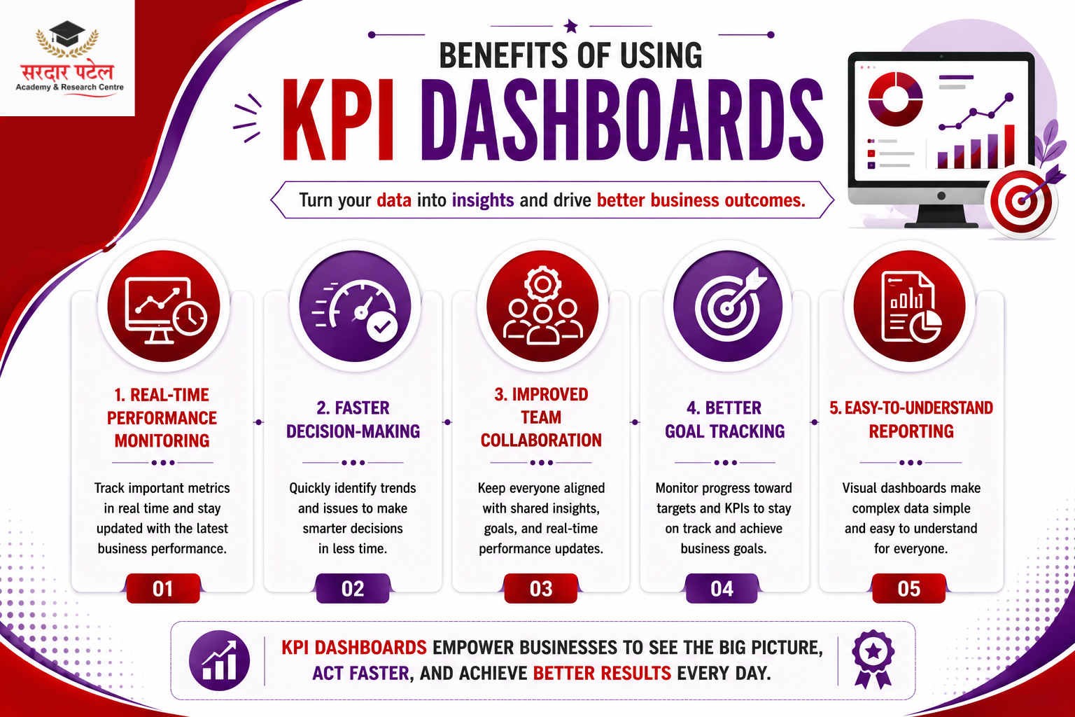
Real-Time Performance Monitoring —
Modern dashboards update automatically, tracking sales performance, revenue, website visitors, marketing campaigns, customer support, and inventory levels so organisations can react quickly when performance changes.
Faster Decision-Making —
Instead of reading multiple reports, managers can identify trends in minutes. If sales performance starts to decline, the dashboard detects the change quickly, enabling teams to identify the cause and respond before the situation worsens.
Improved Team Collaboration —
When everyone works from the same dashboard, teams stay aligned, goals become clearer, progress is easier to measure, and meetings become more productive.
Better Goal Tracking —
Businesses set goals every quarter, such as increasing sales by 20% or improving website conversions. A KPI dashboard tracks progress toward these goals automatically — directly supporting overall management efficiency.
Easy-to-Understand Reporting —
Visual dashboards make information accessible even for people without technical knowledge, letting stakeholders understand charts, graphs, and scorecards at a glance.
Key Components of an Effective KPI Dashboard
A great dashboard isn't just a collection of charts — every element should help users answer important business questions.
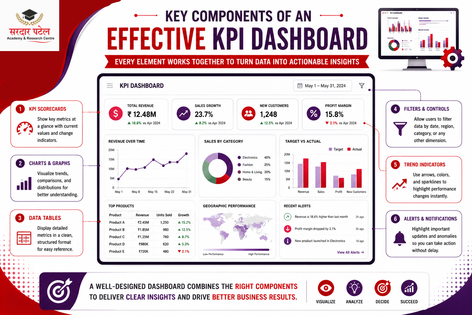
KPI Scorecards —
Display the current value of important metrics like Total Revenue, Monthly Sales, Customer Satisfaction Score, New Customers, and Profit Margin, usually shown at the top of the dashboard for quick visibility.
Charts and Graphs —
Bar charts, line charts, pie charts, area charts, doughnut charts, and scatter plots help users understand trends quickly. Choosing the right chart makes your dashboard more effective.
Filters and Slicers —
Interactive filters let users view data by month, year, product category, region, sales representative, or customer segment, helping them analyse data from different perspectives.
Trend Indicators —
Show whether performance is improving or declining, for example: ▲ Sales increased by 15%, ▼ Customer complaints decreased by 8%, ▲ Website traffic grew by 22%.
Target vs. Actual Comparison —
One of the most valuable dashboard features. Comparing actual performance with business targets highlights where the business is meeting or exceeding expectations, and where improvements are needed.
Types of KPIs You Should Track
Not every business measures success in the same way — the KPIs you choose should align with your objectives.
- Sales KPIs — Monthly Revenue, Total Orders, Average Order Value, Sales Growth, Conversion Rate, Revenue by Product.
- Marketing KPIs — Website Traffic, Cost Per Lead (CPL), Click-Through Rate (CTR), Conversion Rate, Return on Ad Spend (ROAS), Social Media Engagement.
- Finance KPIs — Profit Margin, Operating Expenses, Cash Flow, Budget vs. Actual, Gross Revenue, Net Profit.
- Customer Service KPIs — Customer Satisfaction Score (CSAT), Net Promoter Score (NPS), First Response Time, Ticket Resolution Time, Customer Retention Rate.
- Human Resources (HR) KPIs — Employee Turnover Rate, Attendance, Training Completion, Employee Productivity, Recruitment Time, Employee Satisfaction.
Business KPI Dashboard Examples by Industry
Understanding real-world dashboards makes it easier to design your own.
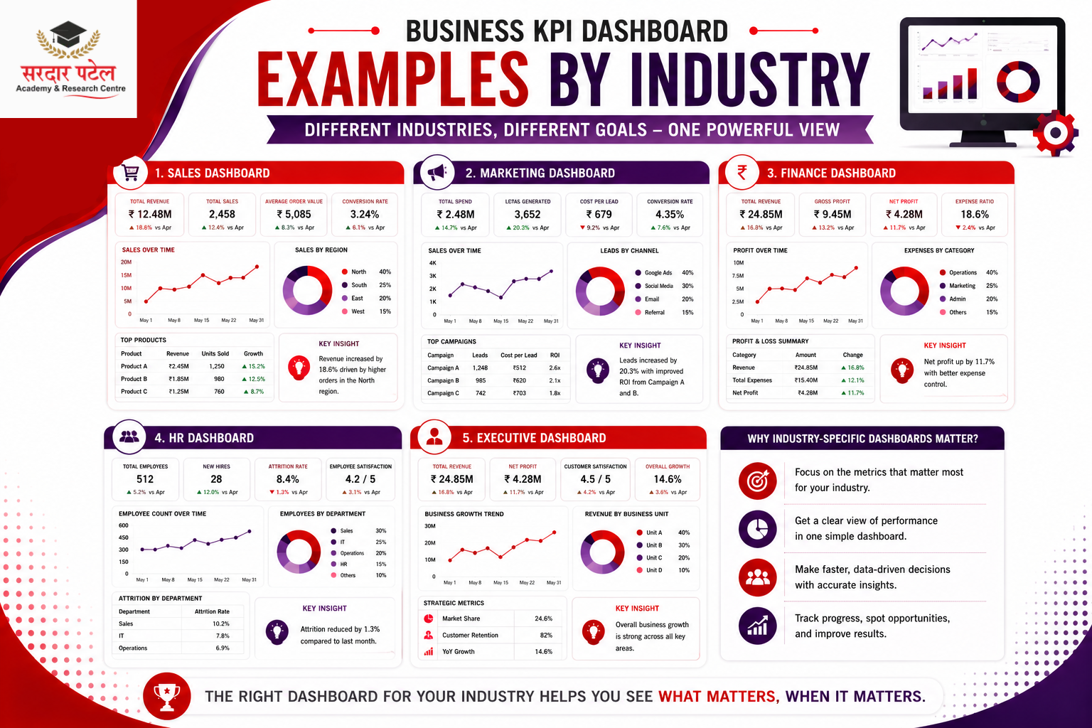
- Sales Dashboard — Tracks Total Revenue, Monthly Sales Trend, Top-Selling Products, Regional Sales Performance, and Sales Target vs. Achievement, helping sales managers monitor progress and identify areas for improvement.
- Marketing Dashboard — Displays Website Visitors, Lead Generation, Cost Per Click (CPC), Conversion Rate, Campaign ROI, and Social Media Reach, giving marketers a complete overview of campaign effectiveness.
- Finance Dashboard — Shows Revenue, Expenses, Profit Margin, Cash Flow, and Budget vs. Actual, supporting finance teams in planning and forecasting.
- HR Dashboard — Measures Employee Attendance, Recruitment Progress, Employee Turnover, Training Completion, and Workforce Productivity, helping HR teams improve talent management.
- Executive Dashboard — Summarises Revenue, Profit, Customer Growth, Employee Performance, and Business Targets at a strategic, high level rather than detailed operational data.
How to Choose the Right KPIs for Your Dashboard
Choosing the right KPIs is the most important step in this tutorial. A dashboard filled with unnecessary metrics can confuse users instead of helping them make decisions.
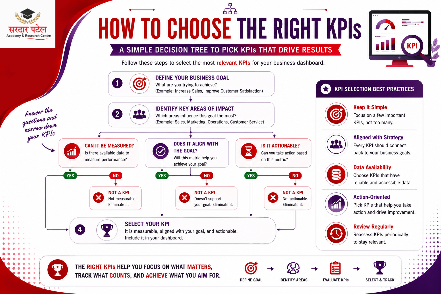
A good KPI should be:
- Specific – Measures one clear objective
- Measurable – Based on accurate data
- Relevant – Supports business goals
- Time-Based – Can be tracked over a specific period
- Actionable – Helps teams improve performance
Before selecting KPIs, ask: What is the business goal? Which metrics directly measure success? Who will use this dashboard? How often should the data update? Will this KPI help improve decision-making? Our guide on data analytics basics for beginners is a good starting point.
For example, if your goal is to increase online sales, tracking website traffic alone isn't enough — you should also monitor Conversion Rate, Revenue, Average Order Value, Cart Abandonment Rate, and Customer Acquisition Cost (CAC) for a complete picture.
Step-by-Step Guide to Building a KPI Dashboard
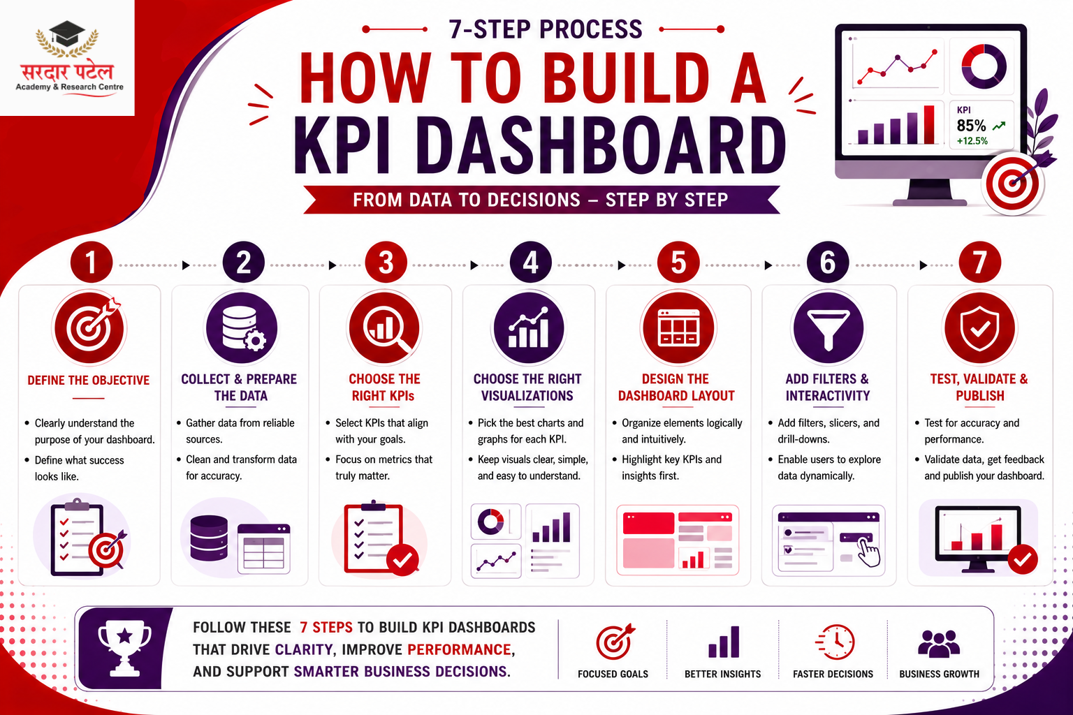
Step 1: Define Your Business Objective —
Every dashboard should answer a specific business question, such as "Are sales increasing?" or "Is customer satisfaction improving?" Avoid creating dashboards without a clear purpose.
Step 2: Collect Reliable Data —
A dashboard is only as accurate as the data behind it. Common sources include Excel files, SQL databases, CRM systems, ERP software, Google Analytics, and social media platforms. Always verify your data is clean and up to date. If you're planning a career in analytics, understanding the difference between SQL and Python can also help you choose the right skills to learn first. Read our guide on SQL vs Python for an analytics career.
Step 3: Choose the Right KPIs —
Select only the metrics that support your business goals, and avoid tracking every available metric just because the data exists.
Step 4: Select the Best Visualisations
Step 5: Design a Clean Layout —
Keep KPI cards (Revenue, Profit, Sales, Customers) at the top, trend and comparison charts in the middle, and detailed tables at the bottom, so the most important information is what users notice first.
Step 6: Add Interactive Filters —
Useful filters include date, region, department, product category, and sales representative, making the dashboard more flexible.
Step 7: Test and Improve —
Verify calculations, check chart labels, ensure consistent colours, test filters, and ask colleagues for feedback before sharing.
KPI Dashboard Design Best Practices
- Keep It Simple — Avoid adding too many charts or KPIs; focus only on what users need to make decisions.
- Use Consistent Colours — For example, Green = Good Performance, Red = Below Target, Blue = Neutral Information.
- Highlight Key Metrics — Place the most important KPIs (Revenue, Profit, Sales Target, Customer Satisfaction) at the top so users understand performance within seconds.
- Choose the Right Chart — Bar Chart to compare categories, Line Chart to show trends, Pie Chart for percentages, KPI Cards to compare targets.
- Limit the Number of KPIs — Most executive dashboards display between 5 and 10 key metrics. Quality is more important than quantity.
- Maintain Consistent Formatting — Similar font sizes, uniform spacing, clear labels, and professional icons create a polished dashboard.
Common KPI Dashboard Mistakes to Avoid
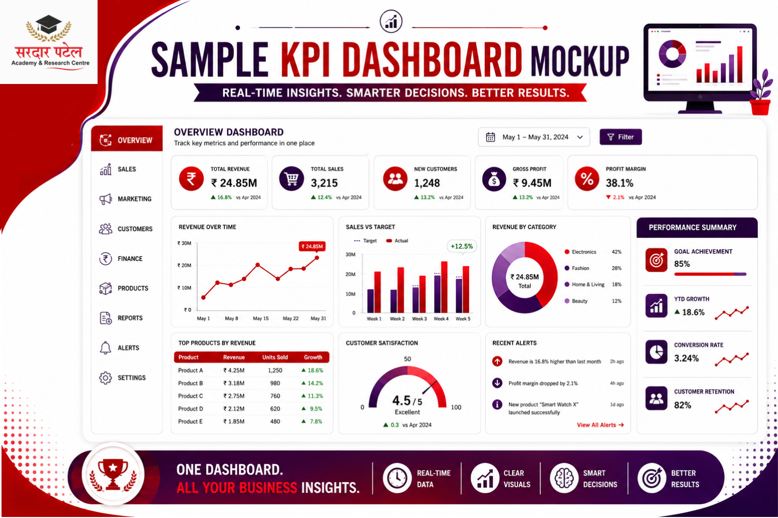
- Tracking Too Many KPIs — More metrics don't always provide better insights; choose KPIs that directly support business objectives.
- Using the Wrong Visualisations — A pie chart with 15 categories makes comparisons difficult; a bar chart communicates the same data far more effectively.
- Ignoring Business Goals — Every KPI should answer an important business question; avoid including metrics simply because the data is available.
- Poor Dashboard Layout — Randomly placing charts creates confusion; group related metrics together for a smoother experience.
- Using Too Many Colours — Bright, inconsistent colours distract users; limit your dashboard to a simple, consistent palette.
- Displaying Outdated Data — An outdated dashboard can lead to poor decisions. Automate data refreshes whenever possible.
Best Tools for Building KPI Dashboards
Today's analysts and business teams have access to several powerful platforms for building these reports.
- Microsoft Power BI: One of the most popular business intelligence platforms, offering interactive dashboards, real-time data updates, drag-and-drop visuals, advanced analytics, and data modeling. Widely used by businesses of all sizes across nearly every industry.
If you're new to Power BI, check out our Power BI dashboard tutorial to learn how to build interactive dashboards step by step.
- Microsoft Excel — A great option for beginners, offering Pivot Tables, Charts, Conditional Formatting, and Dashboard Templates. Ideal for learning dashboard fundamentals before moving to advanced tools. Explore more options in the top data analytics tools you must know.
- Tableau — Known for powerful visualisation capabilities, beautiful dashboards, advanced charts, and an easy drag-and-drop interface. Especially popular in enterprise environments. When weighing the two, teams building fast, everyday operational reports often lean toward Power BI for its lower cost and gentler learning curve, while teams building highly customised, presentation-grade dashboards for leadership tend to reach for Tableau instead.
- Google Looker Studio — A free, cloud-based reporting tool that integrates easily with Google Analytics, Google Ads, Search Console, and BigQuery. Popular among digital marketers for website and campaign reporting.
Which Tool Should Beginners Choose?
If you're just starting, a good learning path is Microsoft Excel → Power BI → Tableau → Google Looker Studio, building a strong foundation in business analytics and dashboard development step by step, much like the path outlined in SPARC's data analytics learning guide.
Conclusion
Building an effective dashboard is more than arranging charts on a screen — it's about turning business data into meaningful insights. As you've learned in this KPI dashboard tutorial, the right KPIs, combined with thoughtful design and accurate data, can help organisations monitor performance, identify opportunities, and make smarter decisions.
Whether you're tracking sales, marketing campaigns, financial performance, or customer satisfaction, a well-designed KPI dashboard provides a clear view of what matters most. By selecting relevant metrics, choosing the right visualisations, and following dashboard design best practices, you can create reports that are easy to understand and valuable for every stakeholder.
Build KPI Dashboards and Advance Your Analytics Skills
Creating professional KPI dashboards is one of the most valuable skills for today's data analysts and business professionals. Start by learning tools like Microsoft Excel, Power BI, Tableau, and Google Looker Studio at Sardar Patel Academy & Research Centre (SPARC), then practice building dashboards with real business datasets.
If you want hands-on experience with dashboard creation, data visualisation, SQL, Excel, and Power BI, enrol in SPARC's Data Analytics Course with AI — a project-based program with 100% placement support.
The more dashboards you build, the better you'll become at transforming raw data into actionable business insights.
FAQs
A KPI dashboard is a visual interface that displays important business metrics in real time. It helps organizations monitor performance, compare results with targets, and make informed decisions using charts, graphs, and KPI scorecards.
A regular dashboard may display general business information, while a KPI dashboard focuses specifically on measurable performance indicators linked to business goals, highlighting whether objectives are being achieved.
Focus on a few essential KPIs such as Revenue, Sales Growth, Conversion Rate, Customer Satisfaction (CSAT), Website Traffic, and Profit Margin — choosing KPIs that align with your business objectives rather than tracking every available metric.
Microsoft Excel is great for beginners; Power BI is best for interactive business dashboards; Tableau is ideal for advanced data visualization; and Google Looker Studio is perfect for marketing and web analytics.
A good dashboard typically contains 5 to 10 key performance indicators. Including too many metrics can make the dashboard cluttered and reduce its effectiveness.
Common examples include Sales, Marketing, Finance, HR, Customer Service, and Executive dashboards, each designed to monitor performance in a specific business area.
KPI dashboards help organisations monitor progress, identify trends, measure performance against goals, and make faster, data-driven decisions, improving reporting, transparency, and strategic planning. If you'd like to understand this at a foundational level first, our guide on data analytics basics for beginners is a good starting point.